On design and code
3/28/24 — CCA GD Interactive 1
*Hellos, thank yous and pleasantries*
So I graduated from Parsons in Fall of 2022, where I actually took a class taught by Roon, which is similar to the one that you all are taking with him now!
This is a project I did for that class, where I built this website to view and filter a collection of poetry written by Shakespeare.
Today I’m going to show you some of my projects and try to walk you through some of the ways that I think about the relationship between these two things in my practice.
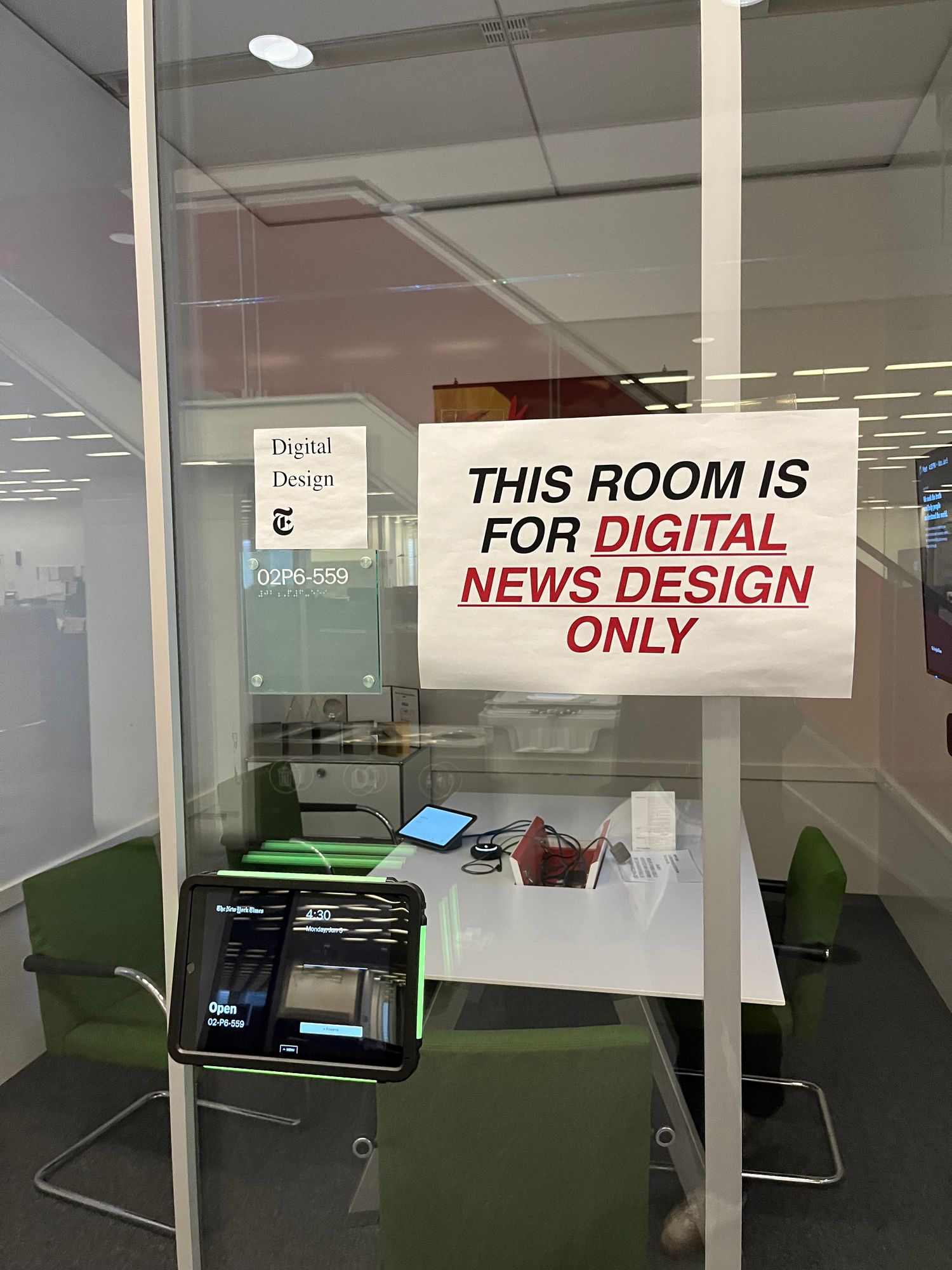
To start off, currently I’m doing a one-year fellowship at The New York Times, on the Digital News Design team.
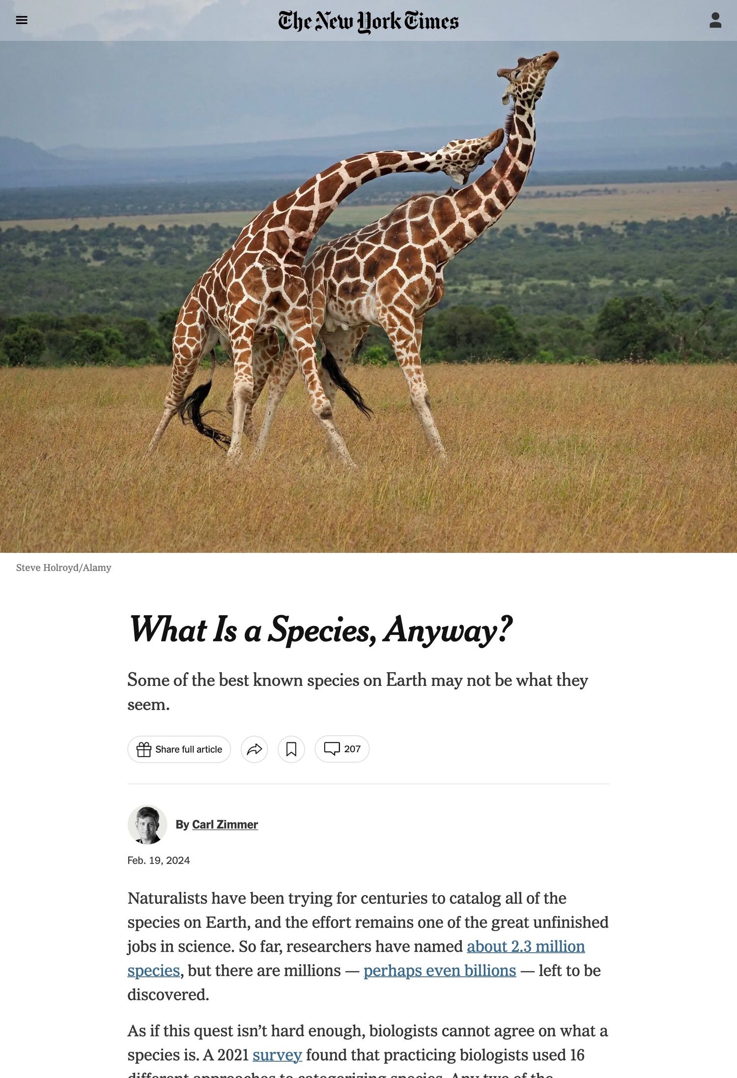
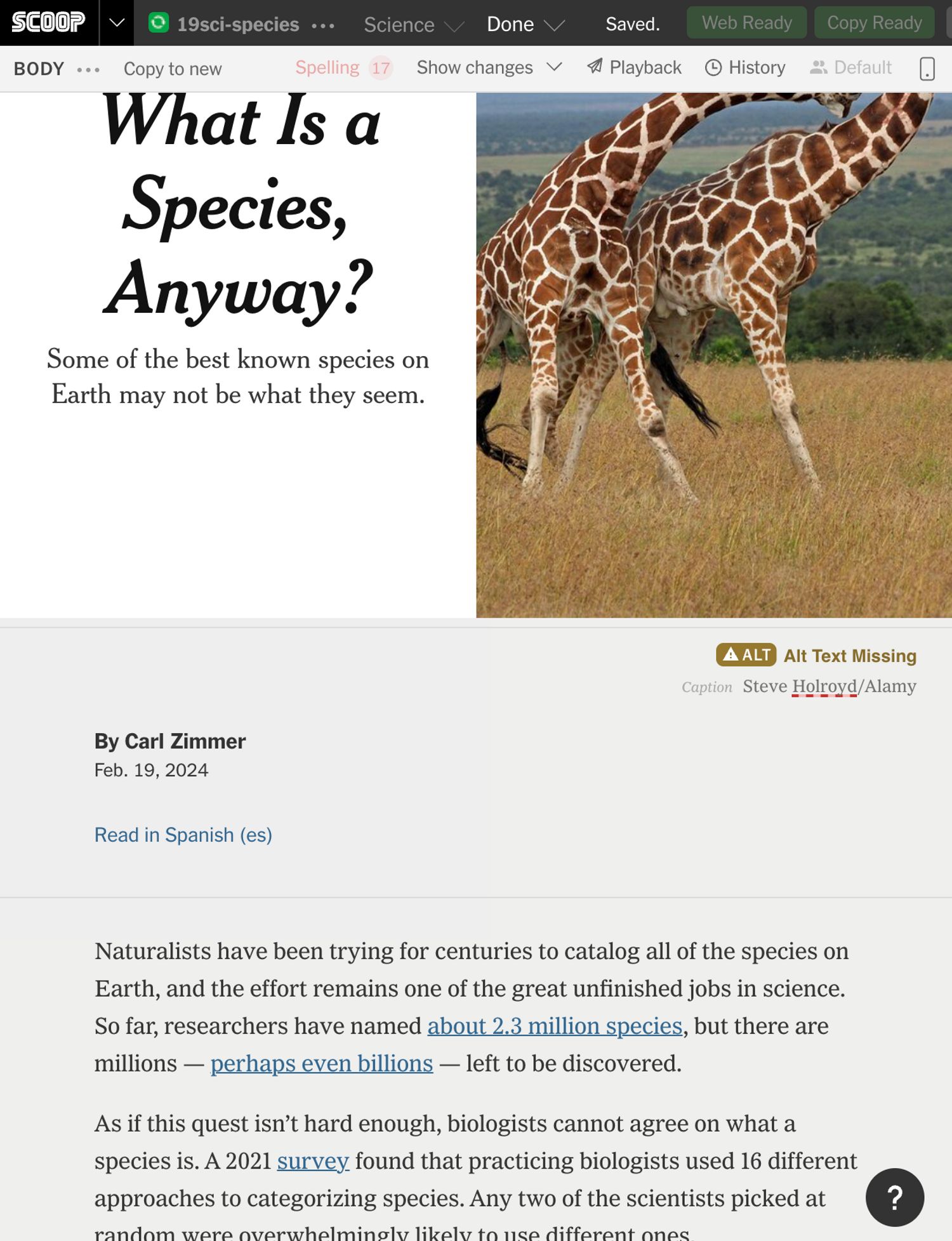
When you think of The New York Times’ digital presence, this is what you might picture; the basic template used by ~90% of articles published by the Times. It works really well and has a lot of customization options.
But this template is actually designed and maintained by a completely different group of product designers on the business side of the company.
When it comes to design and code, the product team has a more traditionally separated structure: the designers prototype pages, and then a team of software engineers implements them.
In addition, the product team is outside of the newsroom. That means they usually don’t work directly with writers and editors on individual stories. Instead, there’s a content management system that allows the newsroom to publish articles from a template with a set of options.
By contrast, the Digital News Design team is embedded inside of the newsroom, and we work on producing individual stories from start to finish. It’s a relatively small team, and we program all of our own projects.
In essence, the team exists to break out of the normal article template, when something can be done with the visual and interactive presentation to enhance a reader’s experience. I think of basically two ways that we intervene in projects
The first is when something about the structure of the story, as its given to us by writers and editors, would be easier and more engaging to navigate in a custom format.
So for example, I worked on the 52 Places list, which is an article the travel desk puts out every year suggesting 52 places to visit. Since it has this well-defined list structure, we can make it easier to browse and emphasize the photography for each location.
As another example, this is a politics story I worked on where the reporter went through every candidate in the Republican presidential primary and analyzed their position on different policy issues.
Our role in this story was creating a format where you can easily browse and filter the positions of each candidate.
On the other hand, sometimes we as designers and editors come up with formats that change the way that a story is written or structured.
So this is a story about two research laboratories in Silicon Valley that invented many of the basic elements of modern computers in the 60s and 70s, like the computer mouse, the internet, and graphic user interfaces.
The desk editors came to us because they thought it could be interesting to include a timeline of historic milestones, although they weren’t sure how it would integrate with the rest of the article.
As the designers we thought through how to place it inside of the story, what events could be included, and what imagery we could use. Then we collaborated with the editors and the writer to rewrite and add to the story so it fit with the format.
You see the same idea in this story about the 50th anniversary of The Exorcist film.
In this case, the primary designer (Tala Safie) and the editors on the culture desk came up with this idea to contrast the reactions people had to the movie when it came out (which you can see on the white background) with new interpretations of it from New York Times film critics (which you can see in the black).
For the reactions, Tala spent a lot of time with the photo editor going through old news clippings and videos to source the quotes and media that made it into the piece.
What I’m getting at is, especially in these latter cases, having complete control over the production and visual presentation via coding empowers our team not only to break out of the existing templates, but to create new “templates” and workflows that shape the output of writers and editors.
The next idea that I want to urge you to consider is that there’s a kind of continuity between graphic design and programming, to the point that you can consider them two parts of a single process.
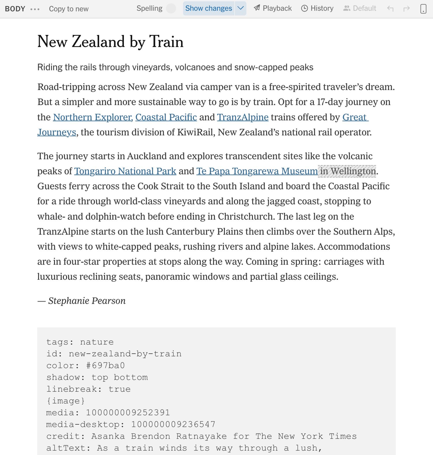
This is the desktop version of the 52 places article I showed you earlier. As you can see, there’s a design system for each location, with a typographic and visual hierarchy for information about each location.
Analogously, on the programming side we have to design a hierarchy and a data structure that allows the machine to treat different pieces of information differently.
So for this article, we wrote a program that reads text from the New York Times content management system, where the editors were working, and converts it into the HTML / CSS / JavaScript output you saw just now.
You can also see we added a way for the editors to add a set of tags to each location
Then in the interface, we were able to take that encoded information and build a function to filter the locations by those tags.
Both design and programming, then, are concerned with figuring out how to logically structure information and make it legible.
Additionally, both design and programming involve coming up with creative resolutions to problems within a set of given constraints.
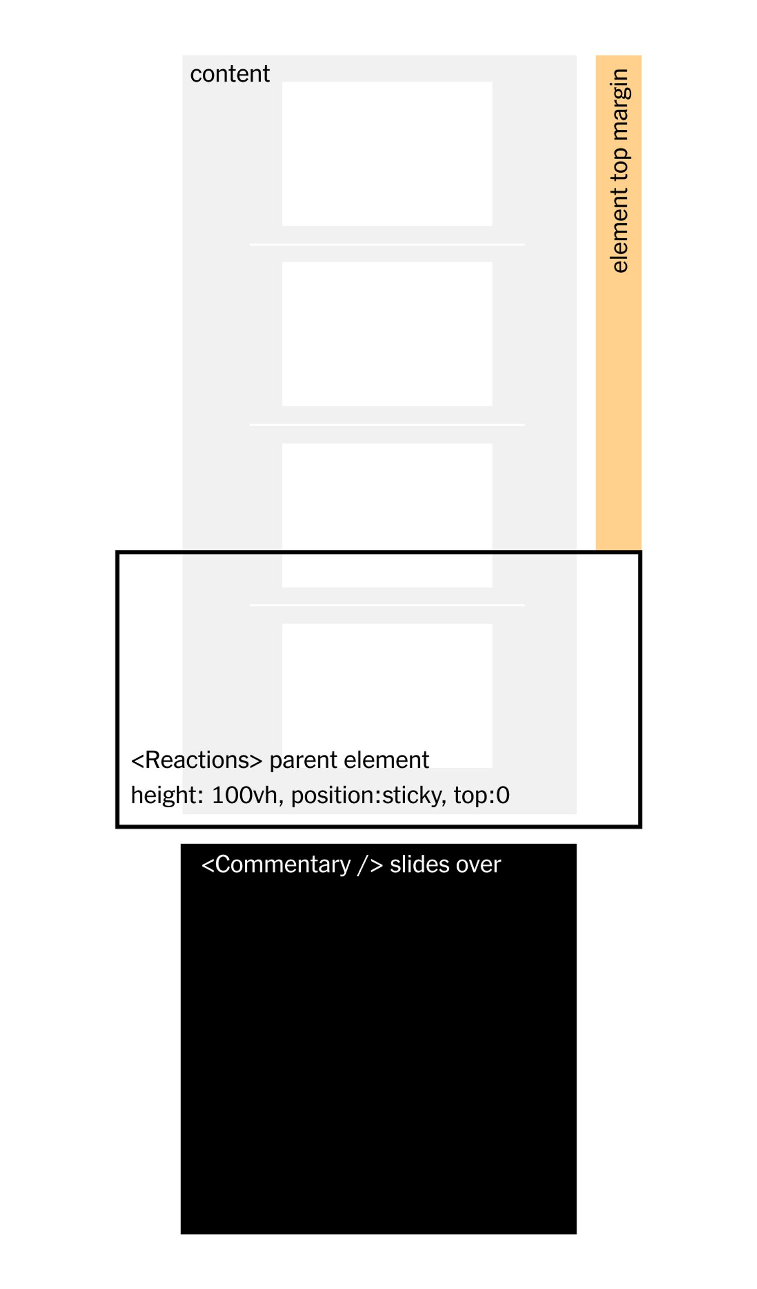
For example in this piece, I had to figure out how to achieve this “curtain” effect where one element stays in place while another element slides over it. I drew this diagram to help work out the math that would be involved.
Particularly in web development, you’re constantly manipulating geometry and applying the tools of HTML and CSS to achieve unconventional outputs.
That brings me to my next idea, which is that the constraints imposed by programming languages and the web can creatively inform your work.
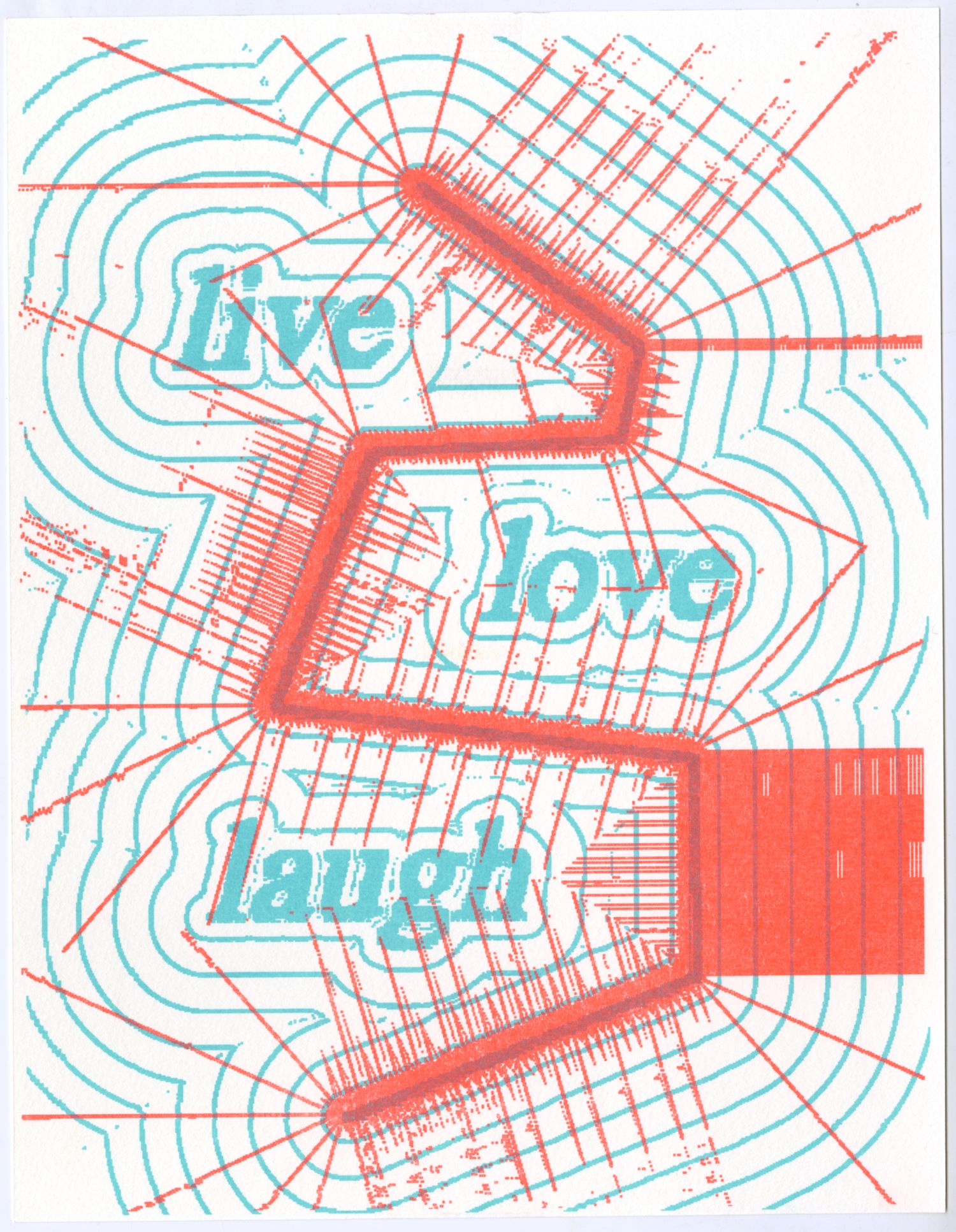
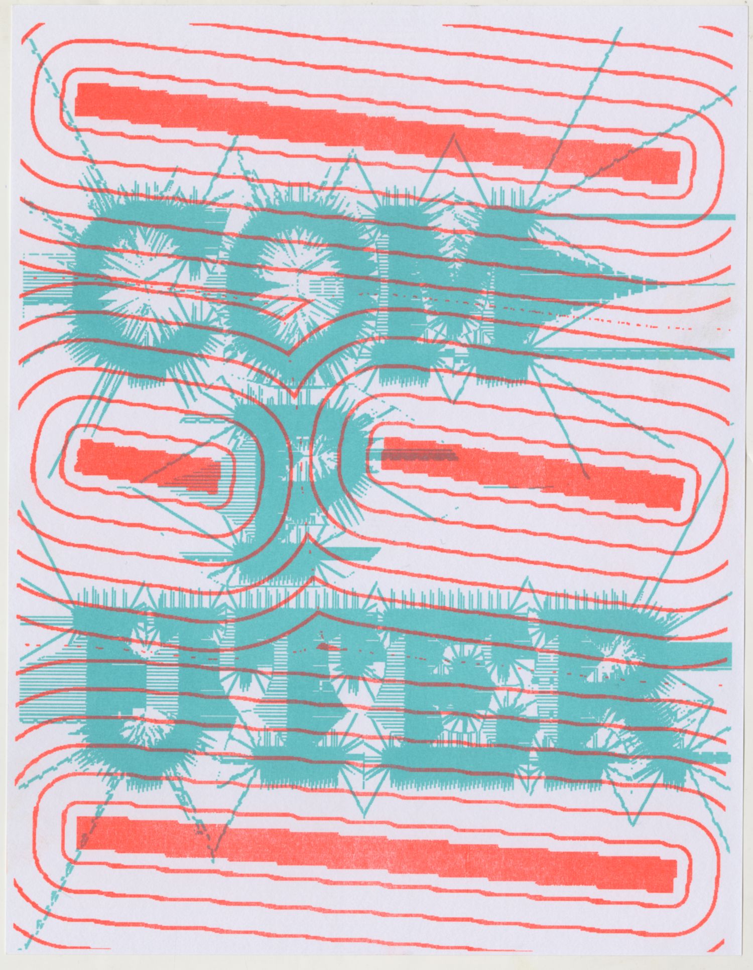
Moving away from NYT work, this is a freelance web design project I’m working on with my friend Patrick. The site presents a multimedia “manifesto” made up of artworks and statements produced during a set of workshops. Here you’re seeing some static mocks we’ve produced so far in Figma.
The manifesto uses the metaphor of “glitching” to suggest ways that artists can transcend social, political and technical barriers. Patrick and I thought it would be interesting to try to bring that motif into the web design through the ways that pages transition.
At some point I moved to code and started testing out our ideas for this in a live canvas. WebGL allowed us to animate the images with displacement maps and progressive pixelation. And for the text I came up with this idea to flash the words on different pages on and off in a random sequence.
You can see here that programming allowed us to explore possibilities that are beyond the constraints of what you can achieve, at least quickly, in traditional design tools like Figma or Adobe software. And we could test it quickly and dynamically with different types of content, without having to do a bunch of clicking and dragging.
As I hope all these examples have been demonstrating, a driving principle in my work is using code as a way to break out of or introduce new creative constraints in projects.
I think the tools and templates that we adopt condition the types of work we're able to produce or even imagine.
To me, being a programmer means considering the tools that I use in my work and my life as part of my practice, rather than external constraints.
Here is another project I did in school, for a class where we learned how to write shaders with webGL. It calculates “signed distance fields” which record the shortest distance of each pixel from an input that you provide, and use that data to visualize waves and lines projecting out of type and abstract shapes.
I was interesting in introducing a new functionality that expands what’s possible to do easily in existing design software.
After building the tool I shared it with a group of friends, and had them design posters with it that I printed on a risograph machine.
Going beyond design tooling, I’ve been concerned for a long time with how the social interfaces we all use condition our behavior and impose toxic constraints on the way that we interact online.
Designing and programming my personal website allows me to escape those platform constraints and come up with new avenues for expressing myself and publishing work.
For example, I built a template for my writing that allows me to incorporate custom elements like sliding image galleries and interactive footnotes, which then shape the way that I write.
I also built this template that allows me to build custom collections of different text and media. I use these to share and catalog a wide variety of things, and I’ve built custom integrations for it, like one page that pulls from an are.na channel.